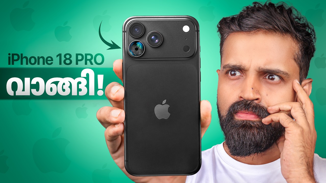
iPhone 18 Pro - Unboxing and Initial Review in Malayalam
By Mr Perfect Tech · Tech · 360.2K views · 9:30
The teardown in brief
What's working
- The honest 'don't buy' verdict at 8:43 is the single strongest retention moment in the video — it reactivates any viewer who's been half-watching because it's a specific, actionable, contrarian recommendation they didn't expect.
- The aperture blades demo at 5:16-5:48 is visually engaging and the explanation of f-stops, while basic, is delivered clearly and serves the mainstream audience well. The graph holds flat here.
- Opening price framing (64,900 vs iPhone 17 Pro at 30,000 more) in the first 10 seconds gives Malayalam audience a concrete anchor point that creates immediate relevance — 'is this worth it?' is the question they're here to answer.
What's costing attention
- No stakes are ever stated. 'Should I buy this phone?' is implied but never explicitly framed as the question being answered, so there's nothing pulling the viewer through the sections toward an answer.
- The 'no change' message is technically the video's throughline but is delivered as a complaint rather than a structure. A 'how much of your 64,900 rupees is new?' frame would turn the same information into a building argument.
- Three 'I'll cover this in the detailed review' deferrals in the second half teach the viewer that this video is a trailer for the real video, not the real video itself.
The first 30 seconds
സോ ഇതാണ് ലേറ്റസ്റ്റ് ഐഫോൺ 18 proയുടെ ബോക്സ്. ഞാൻ 64900 രൂപ കൊടുത്ത് വാങ്ങിച്ചിരിക്കുന്ന ഫോൺ. 30,000 രൂപ — അതായത് 30,000 രൂപയാണ് കഴിഞ്ഞ വർഷം വന്ന ഐഫോൺ 17 proയുടെ പ്രൈസ് വെച്ച് നോക്കുമ്പോൾ ഇത്തവണ ട്രില്യൺ ഡോളർ കമ്പനിയായ ആപ്പിൾ കൂട്ടിയിരിക്കുന്നത്. പെട്ടെന്ന് അൺബോക്സിങ് കാണിച്ചു തരാം.
Strong Tier 1 opening — the box is visible at 0:00, price is stated at 0:06, and the value comparison (₹30,000 more than last year) lands at 0:10. Viewers who clicked on 'iPhone 18 Pro unboxing' are confirmed they're in the right video within the first 10 seconds. The above-100% start on the real graph confirms replay behavior in these opening seconds.
Where viewers drop
1:00 — Repetitive 'No Change' Drumbeat (moderate)
For two full minutes you tell your viewer the same thing on loop — design: no change, display: no change, display brightness: no change, Samsung does it better. By the time the laughter break lands at 3:19, the viewer has heard 'ഒരു മാറ്റവും വന്നിട്ടില്ല' (no change at all) four separate times. They start to feel like they already know where every sentence is going.
Why it matters — When viewers can predict what's coming next, they leave. The rhythm of 'department X — same as last year' three times in a row trains them to expect the fourth and skip ahead.
1:59 — Mid-Video Subscribe CTA Breaks Flow (mild)
At 1:59 you've just finished teasing the aperture blades — the one genuinely new thing in this phone — and instead of going there, you park the video for a subscribe ask. The viewer who's with you in that moment gets a full stop instead of a bridge.
Why it matters — CTAs placed before the main payoff give viewers a natural exit ramp. In this video the aperture feature is the headline — anything between the tease and the demo is friction.
3:54 — Performance Section Deflates Its Own Stakes (moderate)
You announce a 'first-ever nanometer chipset in an iPhone' — that's genuinely exciting — and then immediately tell 95% of viewers they won't feel the difference. The announcement and the deflation happen in the same breath. Viewers who came curious about the A18 Pro are told the honest answer before they've had a chance to get excited about it.
Why it matters — Honest assessment is your brand's value, but the ordering matters. Excitement → benchmark → real-world context lands better than excitement → deflation → benchmark → context. Right now the graph holds flat through this section anyway, but structurally you're wasting the energy of the new chip announcement.
6:56 — Battery + iOS Section Meanders Without Direction (mild)
After the verdict teaser at 6:38, the video covers battery, charging wattage, iOS 27, liquid glass UI, and Siri — each topic for 30-60 seconds — without any of them feeling like they're building toward anything. The 'I'll cover this in the detailed review' caveat appears three times in this stretch, which trains the viewer to feel like this section is a placeholder.
Why it matters — Telling your viewer that you haven't tested something yet three times in a row signals 'this section has no conclusion, come back later' — which is exactly what they do.
How the video is built
- 0:00 Unboxing and first look
- 1:00 Department-by-department assessment
- 8:45 Verdict and buying recommendation
What any creator can steal
- Break the 'no change' loop with a reframe
- Move the 2:01 subscribe CTA to 6:38
- Replace 'I'll cover this in the detailed review' with planted loops
- Front-load the 'don't buy' verdict as a hook element
- Add one section-bridging line at each department transition
- Film a 10-second 'pre-hook' before you do anything else — state your verdict first (would you buy it / would you not), then go into the review. This turns the whole video into evidence for a conclusion the viewer already knows is coming, which is far more watchable than a conclusion that could go either way.
More teardowns from Mr Perfect Tech
Want this on your own video?
Paste any YouTube URL and Retti maps every drop, spike and plateau to the moment that caused it.
Analyse a video free